Choose the job your CSS globe should do
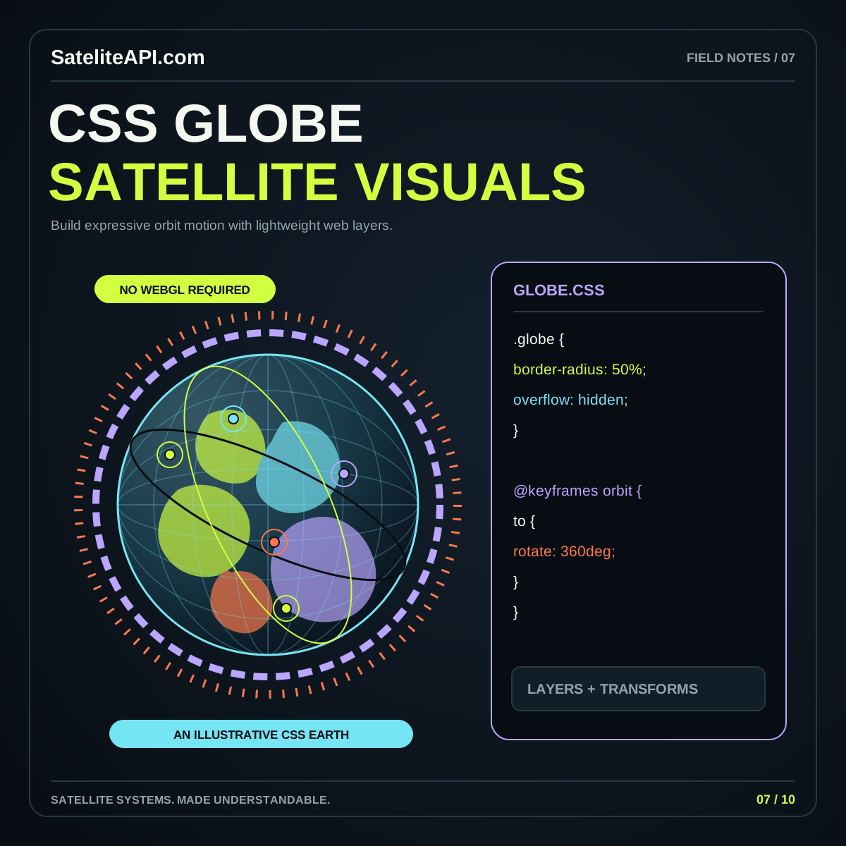
A CSS globe satellite visualization works well when its purpose is clear. It can introduce a global topic, show a small set of labeled concepts or make a learning page feel spatial. Decide whether the visitor is looking at an illustration, a navigation device or a data display. That choice determines which details need mathematical precision and which can be treated as visual styling.
For an editorial hero, a shaded sphere with orbit rings may be enough. For a lesson, several selectable labels might explain Earth, an observer and a satellite path. A detailed tracker needs a separate data model and calculations regardless of how its graphics are drawn. Avoid presenting a looping ring animation as a measurement.
Start with the message in ordinary HTML. Then add the globe as an enhancement to that message. The CSS globe satellite API topic page connects these design choices to the broader SateliteAPI.com learning collection.
Build depth from a small set of layers
Think of the effect as a composition: a stable container, a globe group, surface detail, orbital rings and labels. Give each layer one responsibility. A background gradient can suggest illumination, while a ring can communicate the idea of an orbital plane. Keep decorative stars separate from elements that a visitor can select.
The CSS perspective property controls the apparent viewing distance for transformed elements; MDN explains how this affects the strength of the depth effect in its perspective reference. Choose a value that makes the scene easy to read. Strong distortion can be striking in a hero but confusing around labels or comparison graphics.
Sketch the intended front, middle and rear layers before tuning colors. A globe with clear overlapping shapes often reads better than one with many barely visible rings. Keep text outside the most distorted group whenever the content needs to remain immediately legible.
Keep the transform structure predictable
CSS can position child elements in three-dimensional space through transform-style: preserve-3d. MDN's transform-style documentation also explains that the property is not inherited and that certain grouping effects can flatten descendants. This is why a visual can suddenly lose depth after an apparently unrelated styling change.
Use distinct wrappers for layout, three-dimensional transformation and decoration. Apply a blur or translucent glow to a decorative sibling when applying it to the scene parent would interfere with the intended structure. Give wrappers descriptive names so a later editor understands which element owns perspective and which one owns rotation.
During development, temporarily replace gradients with solid colors and show the element boundaries. Check the scene without rotation first, then introduce one transform at a time. This makes it easier to identify an unexpected pivot, reversed order or flattened layer. Restore the visual polish only after the basic arrangement behaves consistently.
Use motion to explain, and give people control
Assign a reason to every animation. A slow rotation can reveal the shape of a globe. A brief highlight can show which topic was selected. A moving marker can demonstrate a stated concept. If movement exists only to keep the page busy, consider whether a still composition would make the content easier to use.
The prefers-reduced-motion media query lets a page respond to the user's reduced-motion preference. Provide a calm version with the same labels, controls and information. Pausing a rotation should leave a useful illustration, rather than hide the only moment when an important item becomes visible.
Include an explicit pause control for continuous animation. Avoid making pointer movement the only way to inspect an object: touch users and keyboard users need a clear route too. When someone selects a topic, keep the text stable while the graphic responds. Reading should not require chasing a moving label.
Keep information available outside the effect
Make the core content a heading, description and ordinary list of links. If a satellite marker opens an explanation, provide an equivalent labeled button or link beside the scene. Use a visible focus treatment and a sensible reading order. The globe should reinforce the page's structure rather than becoming a separate interface that visitors must decode.
For a purely decorative globe, avoid placing a long sequence of meaningless rings in the accessibility tree. For an informative illustration, write a concise description of the relationship being shown. A useful description might explain that several illustrated orbital paths surround Earth; it should not claim that those paths identify real spacecraft unless they actually do.
Pair colors with words or shapes. An amber marker should also have a name, selection outline or matching list entry. Check the design in a narrow layout and at larger text sizes, especially where the globe sits behind a heading or beside a navigation panel.
For example, a learning panel might offer three buttons labeled Earth, Orbit and Observer. Selecting Orbit can emphasize the relevant ring and update a short explanation below it. Keep the same buttons in the same order when motion is disabled. This gives the illustration a useful teaching role while allowing someone to learn the concept without following an animated point around the sphere.
Set practical limits before adding more elements
A simple globe can become difficult to maintain when every extra marker requires another special transform. Decide on a comfortable scope for the component: perhaps a small concept diagram with a handful of selectable features. If the requirement becomes thousands of independently updated objects, geographic layers or sophisticated picking, reassess the rendering approach.
Measure the actual page with the intended effects enabled. Compare a still version with the animated version, and inspect how it behaves while scrolling or opening navigation. Avoid assuming that a CSS effect is inexpensive merely because it contains little JavaScript. Large decorative layers and complex compositions still deserve a performance review.
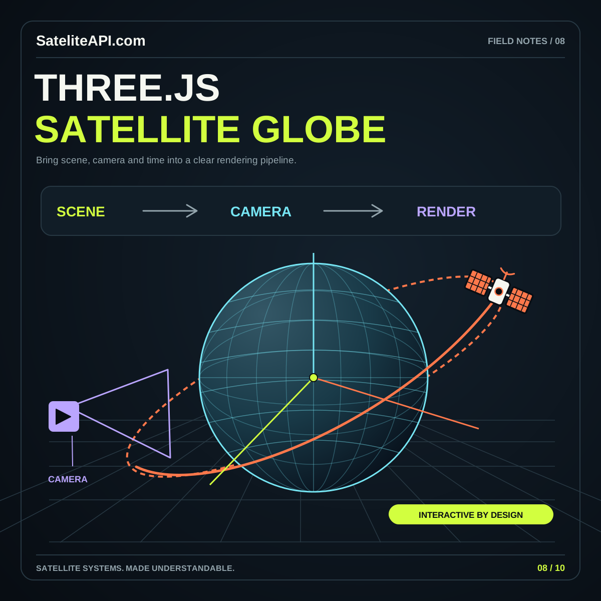
Provide a fallback that retains the message, such as a static SVG illustration and the same content links. The Three.js satellite globe guide explores another option for richer scenes. Choose it because the interaction needs its capabilities, not simply because a globe looks technically ambitious.
Review the globe in the context of the whole page
Picture a reader arriving on a phone to understand satellite tracking. The heading should explain the topic immediately, the opening text should answer a useful question, and the globe should reward attention without blocking progress. Keep its height proportional to the content so the first meaningful link is easy to reach.
Review four states: the initial still frame, normal motion, paused motion and reduced motion. Check each with keyboard focus visible and with longer labels. Also examine a print or simplified reading view. A well-planned illustration can remain recognizable even when its animation and color effects are removed.
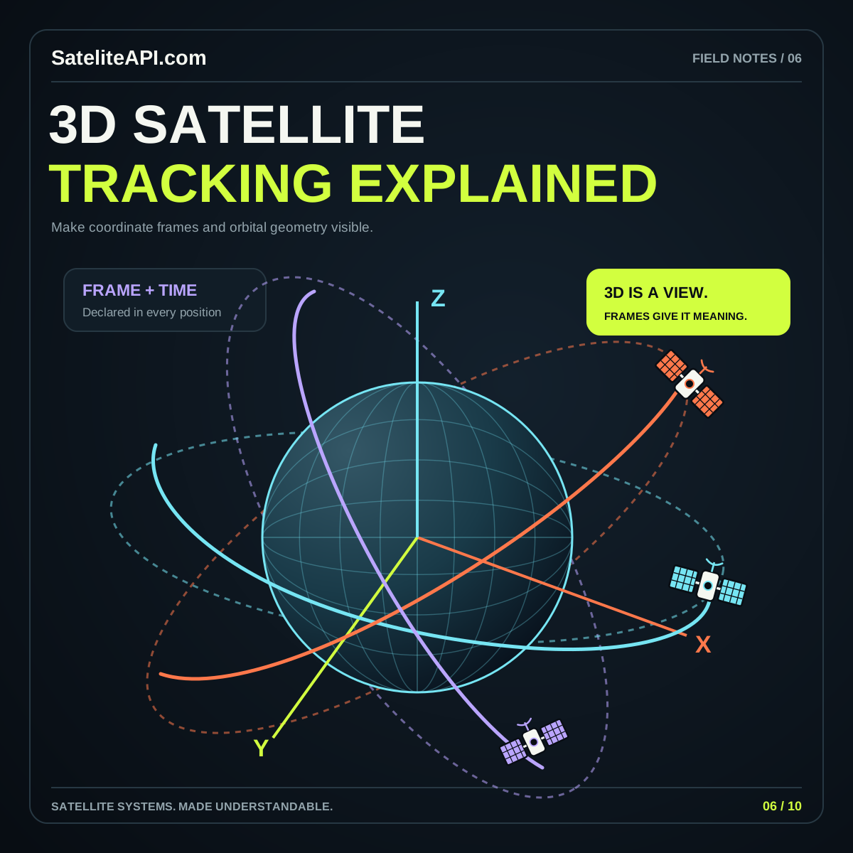
Finally, verify that the words describe what the graphic actually does. Use terms such as illustration, concept or simulation when they fit. For data-oriented work, continue with 3D satellite tracking fundamentals, where coordinate systems, timestamps and clear legends become essential parts of the visual design.
Sources and further reading
Sources were consulted for this general guide. Illustrations are explanatory; orbital and screen examples are not live telemetry.