What a 3D satellite tracker actually shows
3D satellite tracking turns positions and times into a scene that people can explore. The globe supplies geographic context, markers identify spacecraft, and curves describe a chosen interval of motion. A useful tracker makes these relationships understandable before adding atmosphere, glow or cinematic camera movement. Start by asking what someone should learn: where an object is predicted to be, how its path relates to a location, or how several orbital paths differ.
Write a short description of the scene beside the controls. State whether the positions come from a prediction, a recorded dataset or an illustrative animation. Identify the selected time and explain any exaggerated sizes. This lets a visitor enjoy the visual without having to guess what it represents. SateliteAPI.com's 3D satellite API guide provides a starting point for connecting the visual layer to a documented data workflow.
Keep every object in a compatible coordinate frame
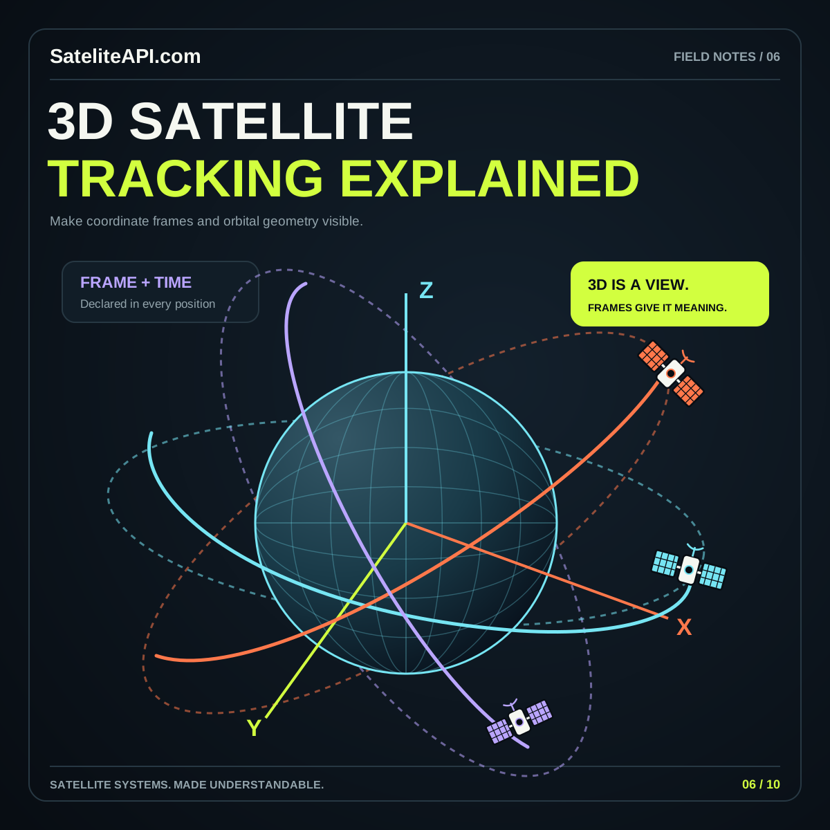
A position needs a reference frame to have meaning. NASA's SPICE reference frames documentation distinguishes inertial frames from frames attached to rotating bodies and describes transformations between them at a specified epoch. A vector expressed relative to distant directions therefore cannot simply be treated as a point on a rotating Earth map.
For a general tracker, choose one scene convention and transform incoming positions into it. Record the source frame, target frame, transformation method and time in the data adapter. Keep those decisions out of individual marker components. Otherwise one layer may rotate with Earth while another quietly follows a different convention.
Make the convention visible during development. Add labeled axes, a recognizable reference location and a pause control. If the geography and orbit appear to disagree, inspect the transformation first. Moving the camera until the result looks plausible can conceal the underlying error.
Treat units and Earth models as explicit inputs
Document whether distances are meters, kilometers or scaled scene units. Also distinguish distance from Earth's center from height above a reference surface. These are different inputs, even when both are casually called altitude. For example, Cesium's Cartesian3.fromDegrees documentation specifies longitude and latitude in degrees and height in meters above an ellipsoid. The order and meaning are part of the interface.
Consider a globe with a display radius of one unit. Convert all incoming distances through one shared scale function; do not divide satellite height in one component and Earth radius somewhere else. Keep the original physical values available for tooltips and exports so a presentation choice never changes the reported data.
A spherical Earth can be appropriate for a teaching illustration. If a workflow needs an ellipsoidal surface, use that model consistently through the relevant calculations and display. Label any simplified or exaggerated view so readers can interpret it correctly.
Consider a provider that reports a height of 500 kilometers while a display helper expects meters. Passing the bare number creates a thousandfold unit error before any camera setting enters the picture. A field named heightKilometers, followed by an explicit conversion, makes the mismatch easier to spot. Add the expected units to example records and error messages so another developer can reproduce the intended interpretation.
Give the scene one clock and several honest timestamps
A tracker should distinguish its display time from the reference time of the source data. In a two-line element set, the epoch identifies the time to which the changing orbital fields refer, as explained in CelesTrak's TLE format FAQ. A recently downloaded file can still contain an older epoch; download time alone does not describe the orbital information.
Use one selected instant for every layer that claims to describe the same scene. When a visitor scrubs forward, update positions, labels and the time readout together. Keep a separate, clearly named record of source epoch and retrieval time. A pause button should freeze the simulated instant even if the application receives a new dataset.
Decide what happens outside the supported prediction interval. A helpful interface can stop playback, offer another time range or explain that no suitable data is available. Quietly continuing a decorative loop would make the timing controls difficult to trust.
Explain paths, ground tracks and coverage separately
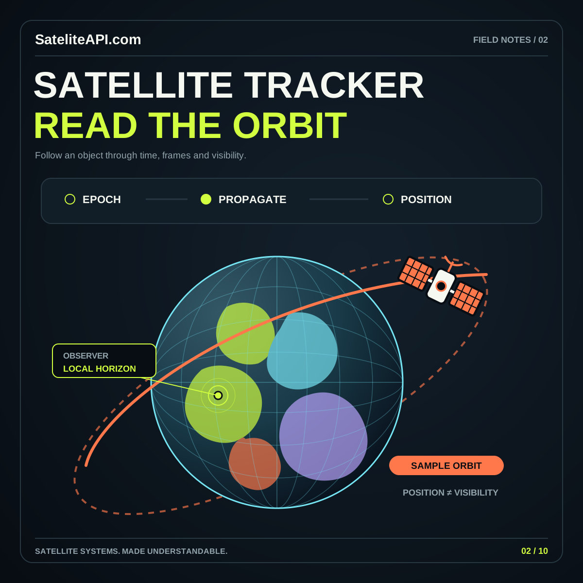
Give each line a precise label. An orbital trajectory is a path through space; a ground track describes corresponding locations on Earth. A line connecting a satellite to an observer is another relationship again. Use a legend that names each visible layer, and let visitors turn layers off independently. This prevents a bright collection of arcs from becoming an ambiguous diagram.
For coverage displays, define the calculation behind the shape. A decorative cone should be described as illustrative. A computed coverage region should identify its assumptions and avoid implying guaranteed reception or optical visibility. Geometry alone does not establish every condition needed for a successful observation or communications service.
Try a simple review exercise: hide all descriptive text and ask a colleague what each shape means. Then restore the legend and ask again. Any remaining disagreement suggests a label, color or interaction needs attention. The satellite tracker API article discusses the data questions behind these views.
Design controls around questions people can answer
Offer a small set of purposeful actions: choose a satellite, choose an observer, select a time, pause playback and return to the default view. Add a plain list beside the globe with the selected object's identifier, data status and relevant coordinates. Someone who cannot comfortably drag the scene should still be able to understand the result.
Separate camera movement from time movement. Rotating around Earth changes the viewpoint; advancing the timeline changes the represented situation. Give these controls different labels and keep a reset for each. A visitor should not lose a carefully selected time merely because the camera becomes disorienting.
Use selection styling more strongly than ambient decoration. One prominent marker, a matching row in the list and a short explanation can communicate more than many glowing objects. Preserve these cues when motion is paused and when the page is viewed on a narrow screen.
Review a tracker as both a calculation and an interface
Build a small reference set before expanding the scene. Include recognizable surface coordinates, a fixed instant, a documented source record and an independently checked result. Compare the values before assessing the appearance. Also inspect transitions across longitude boundaries and verify that units remain consistent when switching datasets.
Test empty data, expired data, an unavailable object and an interrupted refresh. Each state needs a readable explanation that survives without animation. Save the chosen object and time in a shareable representation when practical, so two people can discuss the same view rather than similar screenshots.
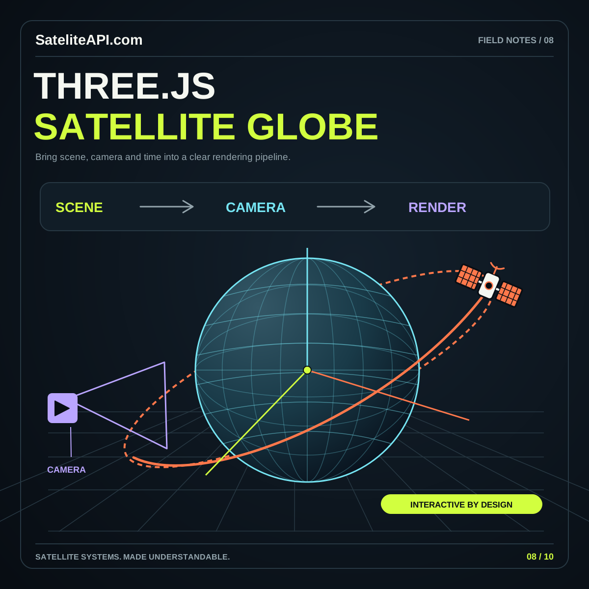
Then review the visual hierarchy: can a first-time reader identify what is selected, what time is shown and whether the scene is illustrative or data driven? With those questions answered, advanced rendering becomes a useful enhancement. Continue with the Three.js satellite globe article for scene organization and rendering considerations.
Sources and further reading
Sources were consulted for this general guide. Illustrations are explanatory; orbital and screen examples are not live telemetry.